Brand New Mobile Interface in SharePoint 2010
The new mobile interface in SharePoint 2010 is definitely improved comparing to the previous version. Sahil has got a short and nice blog post where he shows the basic browsing experience of a SharePoint site and a list in his iPhone. I also tested many different parts of the product in my iPhone and Windows mobile and the result is quite interesting. In this blog post, we will look at InfoPath forms and Excel Workbooks published to Excel Services.
Among many new features introduced in InfoPath 2010 and InfoPath Form Services 2010, are the equal rendition across the major browsers, compliant browser forms , WCAG 2.0, XHTML 1.0, and strict CSS. Below, you’ll see a SharePoint list that’s customized using InfoPath 2010. As you can tell, a browser-enabled InfoPath form is used to create a new training course:
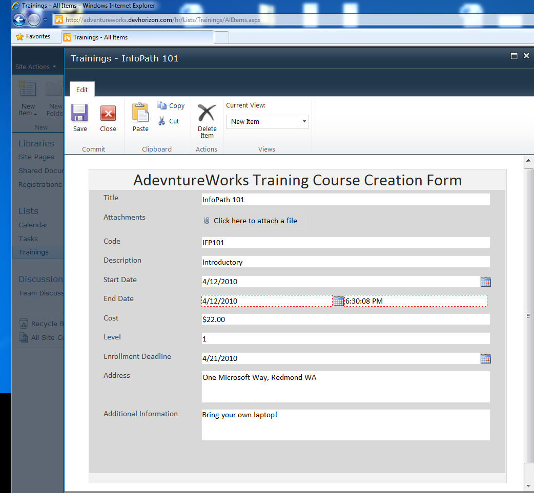
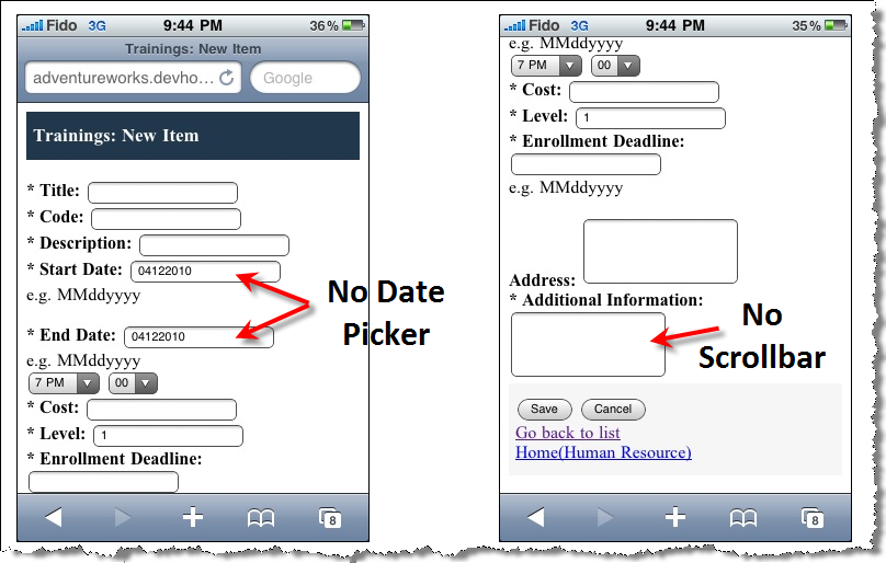
The following Figure shows the specific list item, created above in an InfoPath form rendered for mobile view:

As you can see in the left screenshot, if you have the appropriate permission you can create a new list item directly from within the mobile device or perform other actions.There are a couple of limitations, though. Remember “Enable rendering on a mobile device” in the form option dialog in InfoPath 2007? In InfoPath 2010, by default, every form can be viewed on mobile devices. However, there are unsupported controls and there are those controls that render as plain text boxes such as the Date/Time Picker and People/Group Picker, as shown in Figure below:
Like before, possibilities are endless using the InfoPath object model. you can touch on everything on the form. Literally everything!
You can use the Environment object (in the form’s code behind) to determine which runtime environment and program was used to open the form. This class provides a property called IsMobile which returns true if the form is viewed by a mobile browser. In this particular example, I am setting a field called IsMobileField which will be used later during the form load life cycle (not discussed in this blog post).
[CSharp]
public void FormEvents_Loading(object sender, LoadingEventArgs e)
{
XPathNavigator rootNav = MainDataSource.CreateNavigator();
if (Environment.IsMobile)
{
XPathNavigator mobileFieldNav = rootNav.SelectSingleNode(“/my:myFields/my:IsMobileField”, NamespaceManager);
mobileFieldNav.SetValue(“true”);
}
}
[/CSharp]
Another nice parity between desktop browser and mobile browser is the Excel Web App. The Excel Web App works in IE, Firefox, and Safari. Figure below shows a published Excel Workbook in the browser and in Safari browser in iPhone 3G.For those of you who are not familiar with Excel Web App, it’s an extension of the Excel rich client that allows users to view and edit workbooks in the browser.
Here you go:
A published Workbook in IE:
A published Workbook in Safari browser in iPhone 3G:
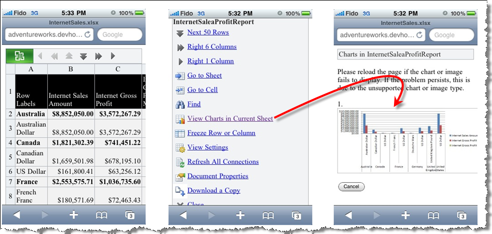
Pretty slick, eh?
As a final remark, don’t forget two techniques:
- Mobile query string for quickly examine the mobile output of a page (it doesn’t work in some page) : http://adventureworks.devhorizon.com/?Mobile=1
- Mobile section in a view (all the way on the bottom of a page), as shown below.


Were you able to interact with the Excel services web-app via the iPhone or iPad? By that I mean actually changing the value of a cell?
I can do it (edit cells) via a desktop browser, but when I open my web-app via mobile Safari the keyboard does not pop up on my iPhone when I click on a cell to edit.
Thanks in advance for your time.